Researched people's perception of the art and design department at Bethel University and created branding that embodied the fun and professional sides of the department.
Many incoming students, current students, and parents do not understand the importance of the art and design department. They see it as a hobby and not a profession. Many are unaware of the art and design world and all of the career opportunities within it.
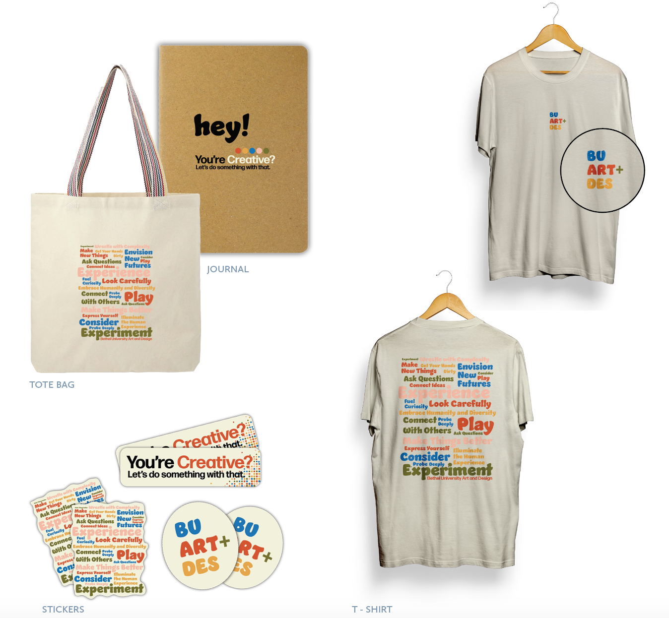
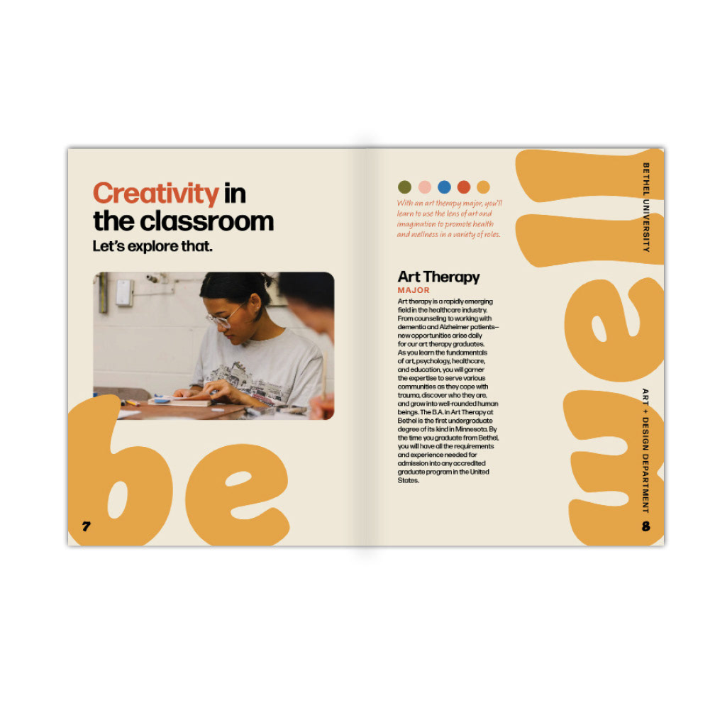
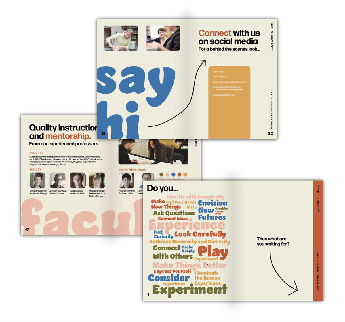
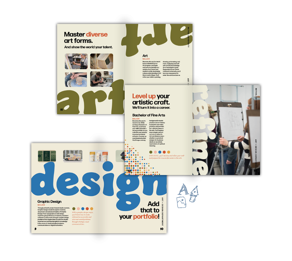
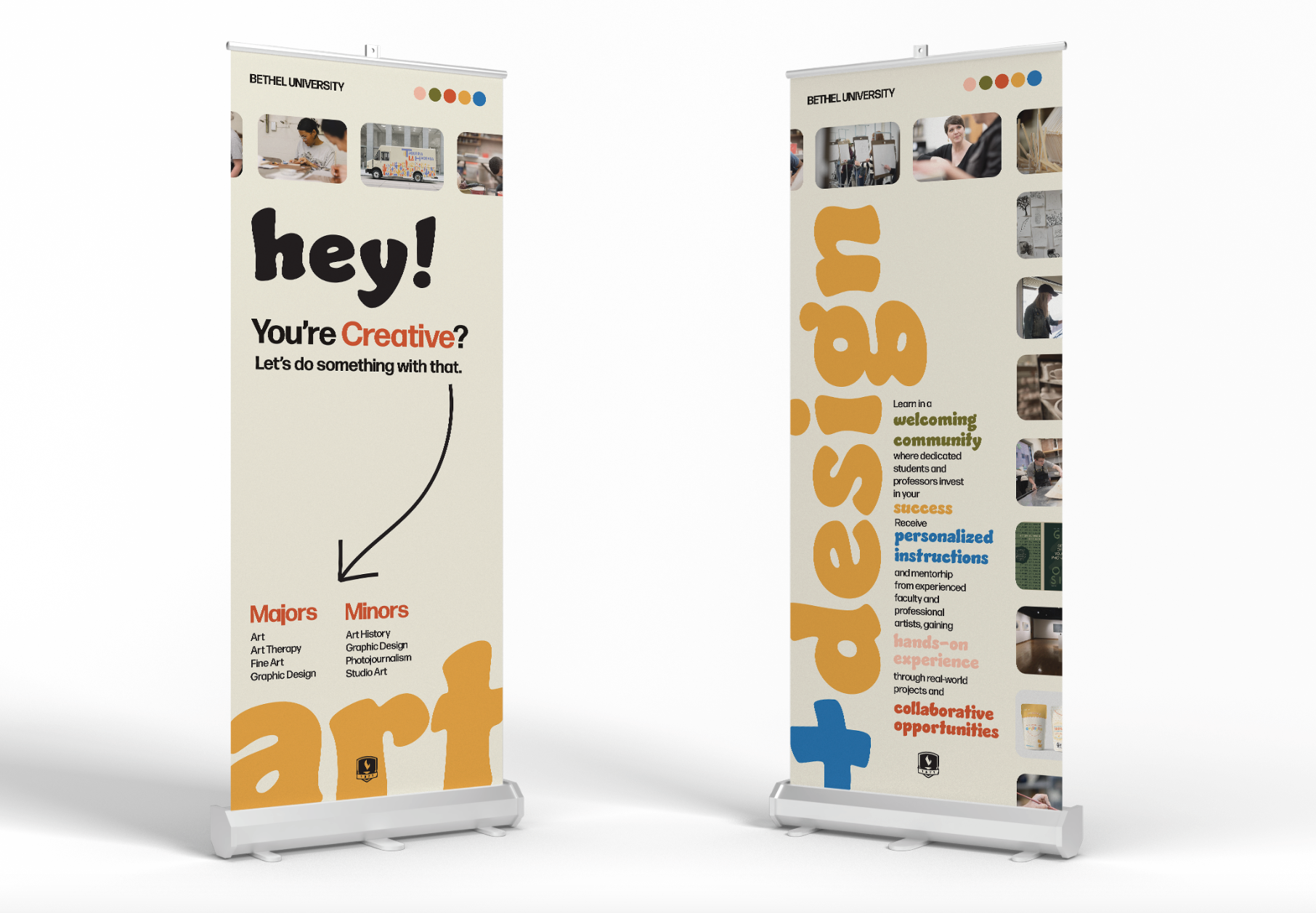
My goal was to create a brand personality that is professional and fun. Both sides must be portrayed to appeal to creatives and professionals. This could be done through clean typefaces and a funky color palette or through a fun typeface and a minimal color palette. The design must be cohesive with its academic setting.
We are hardworking, not lazy
We are fun, not different
We are creative, not weird
We are friendly, not closed-off
To satisfy the problem I discovered throughout my research, I created a design that would communicate professionalism with a creative flair. The messaging is encouraging and shows how Bethel University will help make each student’s creativity and artistic abilities into a viable career. I paired a professional body typeface with a unique display text and fun colors. The colors have a twist on the original academic palette.
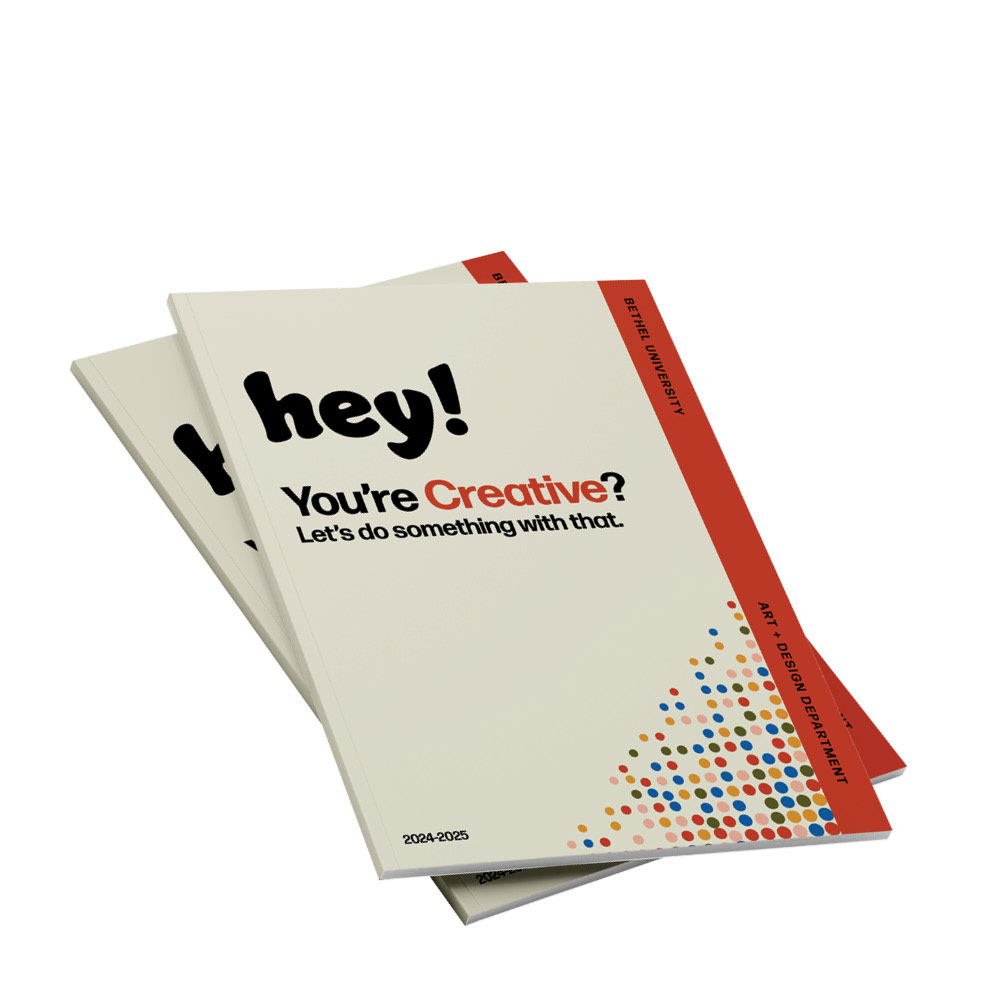
ACADEMIC BROCHURE
SOCIAL MEDIA
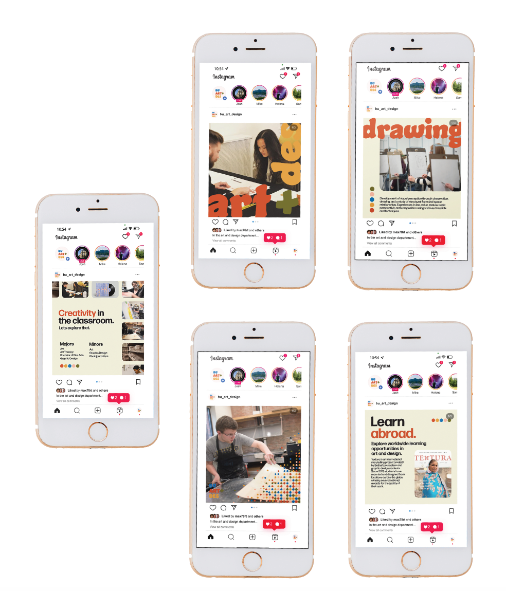
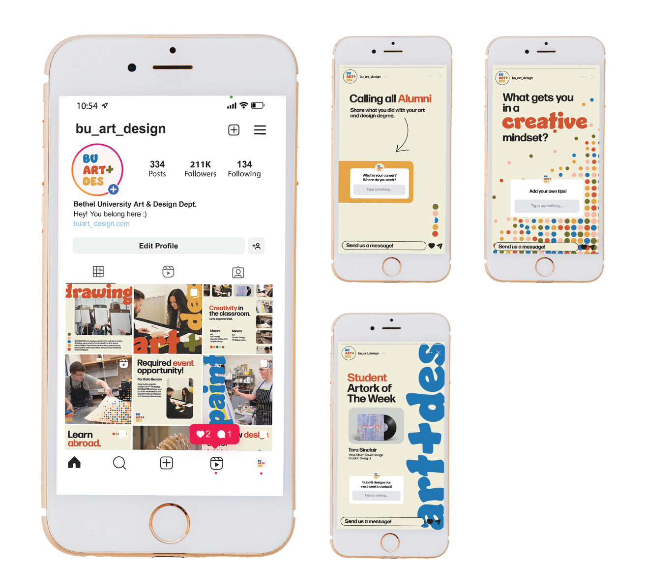
The art and design department's social media strategy is centered on engaging students and providing them with helpful tools and resources. It can also be used to connect students with alumni.
Instagram posts show various content including department information, photos, and events.
Instagram stories are used for collaboration and connection. These are fun and playful.
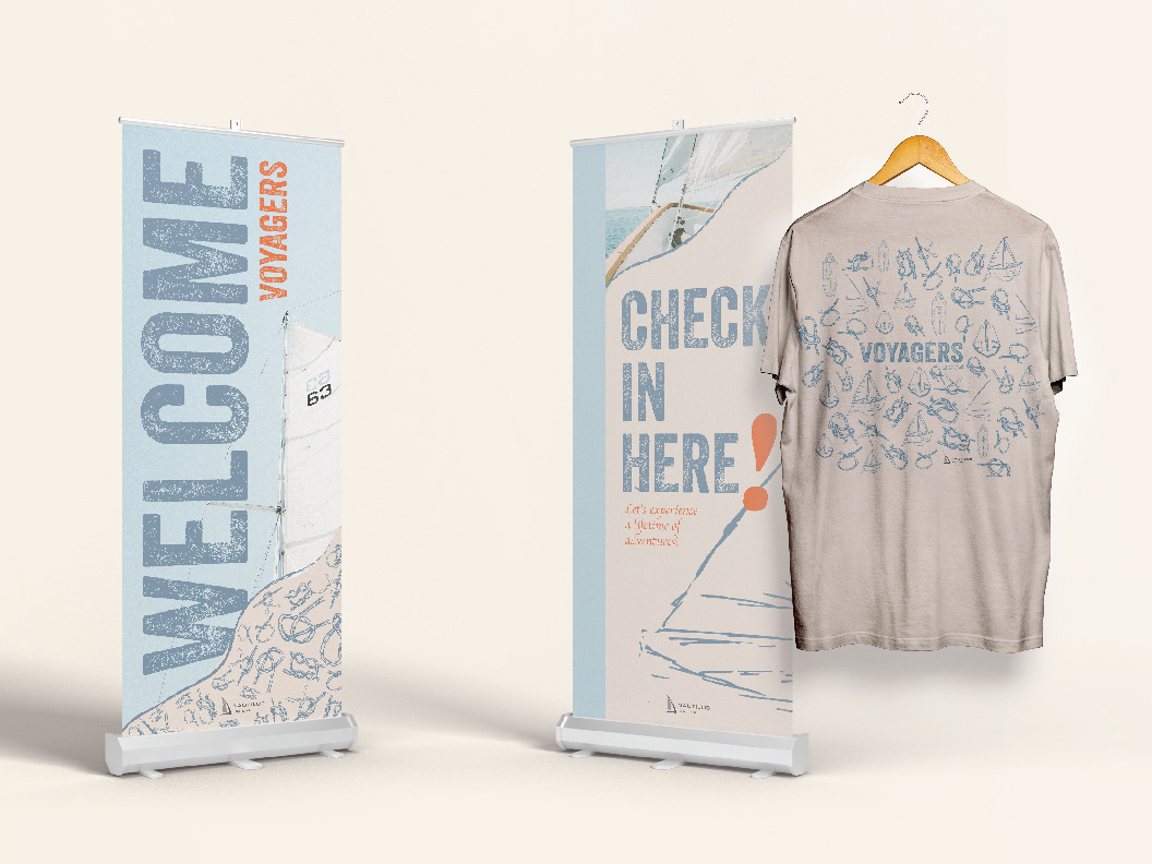
BANNER STANDS
MERCH